The quest for What Color Goes With Everything is a timeless pursuit in the world of fashion, design, and aesthetics.
In a world filled with a kaleidoscope of colors, finding the one that effortlessly complements, enhances, and harmonizes with a wide range of other hues is both an art and a science.
While there isn’t a single color that universally fits this description, a select few come close.
These versatile colors are the foundational building blocks of countless color palettes, offering flexibility and adaptability in various contexts.
From classic neutrals like white, black, and grey to deep, rich tones like navy blue and burgundy, these colors provide the ideal canvas for creating harmonious color schemes in clothing, interior design, and beyond.
Exploring the qualities and applications of these versatile colors can guide us toward a deeper understanding of the art of color coordination and personal expression.
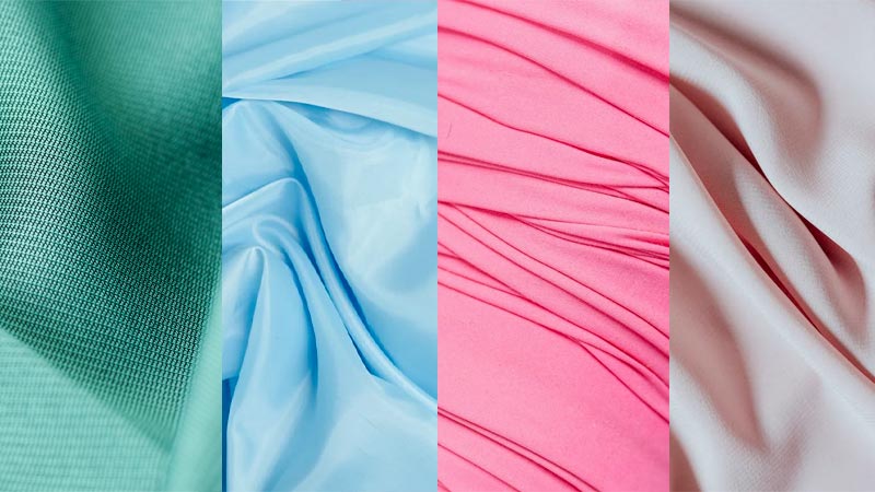
What Color Goes With Everything?
Choosing colors that can go with everything often involves selecting versatile and neutral options that complement a wide range of colors.
Here are some colors that can be considered to go with almost anything:
White
White is the epitome of versatility. It pairs well with nearly every other color, creating a clean and timeless look. Whether in fashion, interior design, or any other context, white can be a backdrop for other colors to shine.
Black
Similar to white, black is another classic neutral. It adds depth and contrasts to any color palette. From clothing to decor, black is a timeless choice that works with almost anything.
Grey
Gray is a neutral color that comes in various shades, from light to dark. It acts as a bridge between different colors, providing a balanced and sophisticated appearance.
Light grey can create a soft backdrop, while dark grey can add depth and drama.
Navy Blue
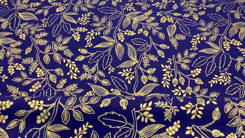
Navy blue is a versatile and elegant colour. It pairs well with numerous shades, making it a go-to clothing and interior design option. Its depth and richness can complement both warm and cool tones.
Beige
Beige is a warm, neutral colour that can blend seamlessly with other hues. It works particularly well with earthy tones and pastels, making it a great choice for creating a cosy and inviting atmosphere.
Olive Green
Olive green is a unique neutral that can be surprisingly versatile. It pairs excellently with earthy and neutral tones, as well as with jewel tones. It adds a touch of nature-inspired colour to any palette.
Burgundy
Burgundy is a deep, rich colour that can act as an accent in various settings. It complements other neutrals beautifully, such as grey and beige, and can also enhance the vibrancy of warmer tones.
Remember that personal style and preferences significantly influence how these colours are used.
Mixing and matching different shades and intensities of these colors can create diverse and harmonious combinations that suit your individual taste and the specific context you’re working with.
What Color Doesn’t Goes With Everything?
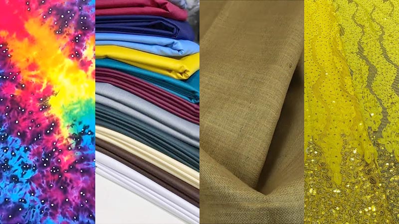
While many colours can be versatile and complementary, there are some that don’t easily blend with everything due to their strong or specific characteristics. Here are some colours that may not go well with everything:
Neon Colors
Neon colours are incredibly bright and intense, making them challenging to pair with other colours. They often clash with more muted or pastel shades. Neon colours are best used as accents or statement pieces rather than dominant elements.
Clashing Complementary Colors
Complementary colours, such as red and green or blue and orange, can create visual tension when placed together. While they are used effectively in some contexts, they can be difficult to combine harmoniously in large quantities.
Very Light Pastels
Extremely light pastel colours like baby pink or baby blue can be challenging to pair with stronger, bolder hues. They may appear too delicate and get overshadowed when placed alongside more vibrant colours.
Brown and Black Together
Brown and black, while both neutrals are often considered a challenging combination. They can appear dull and lack contrast when used together.
However, this combination can work in certain outfits and interior design schemes when styled thoughtfully.
Bright Yellow
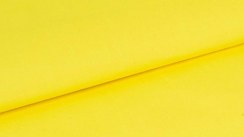
Bright yellow can be a tricky colour to work with since it tends to dominate and can clash with other vibrant colours. It’s best used as an accent or statement colour rather than a primary one.
Muddy or Dull Colors
Colours that are neither fully saturated nor pastel can be challenging to pair with others. Muddy or dull colours often lack the vibrancy needed to effectively complement or contrast with other shades.
Unconventional Fluorescent Colors
Colours like electric blue, neon green, or fluorescent pink can be challenging to match with other colours because of their unconventional and intense nature. They can easily overpower or clash with more typical colour choices.
Keep in mind that while these colours may not go with everything, there are no strict rules in the world of design and fashion. Creativity and individual preferences can often lead to surprising and successful combinations.
It’s all about finding the right balance and using these colours intentionally in your design or style to create the desired effect.
7 Types of Versatile Colours?
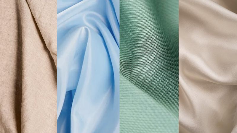
Certainly, versatile colors are essential in various design and fashion contexts as they can seamlessly blend with a wide range of other colors. Here are some of the most versatile colours:
1. Beige
Beige is a neutral colour that embodies versatility. It sits between white and brown, making it an excellent canvas for other colours. Beige can be warm or cool-toned, allowing it to complement both earthy and cool colour palettes.
Whether used in clothing, interiors, or accessories, beige offers a subtle, understated elegance that pairs well with almost any colour scheme.
2. Grey
Gray is a neutral colour that comes in various shades, from light silver to charcoal. Its versatility lies in its ability to work as a background or a focal colour. Light grey can create a soft, airy ambiance, while dark grey adds depth and sophistication.
Grey pairs well with both warm and cool tones, making it a staple in contemporary designs.
3. Navy Blue
Navy blue is a deep, rich colour that exudes versatility and sophistication. It works well with various colours, including white, beige, grey, and even brighter hues like yellow or coral.
Navy blue can be neutral when combined with lighter shades or add depth to vibrant colour combinations. It is a classic choice for both formal and casual settings.
4. Olive Green
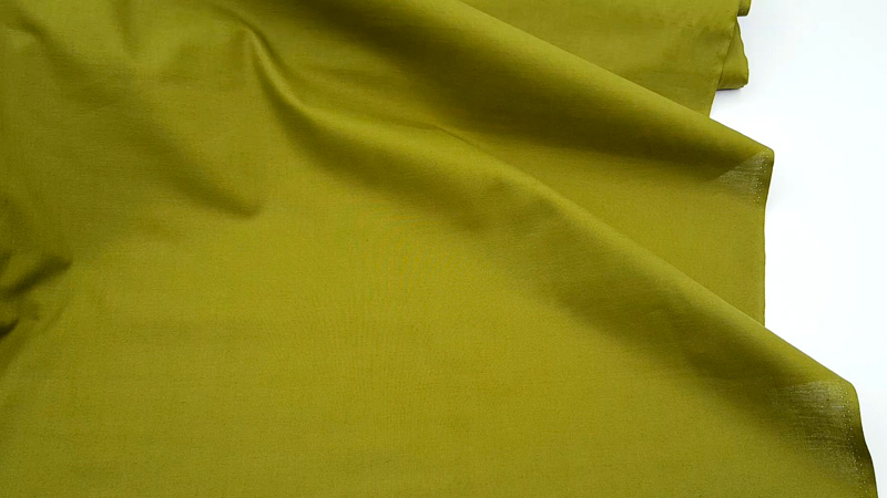
Olive green is a muted, earthy colour that blends well with other neutrals like beige and grey. Its warm undertones make it a versatile choice for both natural and urban-inspired palettes.
Olive green pairs elegantly with cream, brown, and even soft pastels, creating a harmonious and calming atmosphere in interiors and fashion alike.
5. Burgundy
Burgundy is a deep, reddish-brown colour that adds a touch of luxury and warmth. Its versatility shines when paired with neutral colours like beige, grey, or cream, creating a sophisticated and inviting atmosphere.
Burgundy can also complement metallic tones such as gold and brass, enhancing its regal appeal in various design applications.
6. White
White is the epitome of versatility. It signifies purity and simplicity and is a perfect backdrop for other colours to pop. White can be paired with any colour, creating a clean and timeless look.
It is a common choice in minimalist designs and is often used in combination with various textures to add visual interest.
7. Charcoal
Charcoal is a deep, dark grey colour that adds depth and richness to any palette. It works well as an accent colour with lighter neutrals like beige and white, creating a striking contrast.
Charcoal also pairs beautifully with jewel tones, enhancing their vibrancy. Its versatility lies in its ability to add drama and sophistication to both contemporary and traditional designs.
These versatile colours are foundational elements in design and fashion, providing a solid base upon which diverse and harmonious colour schemes can be built. Their adaptability allows for endless creative possibilities in different contexts.
Attractive Colours for People?
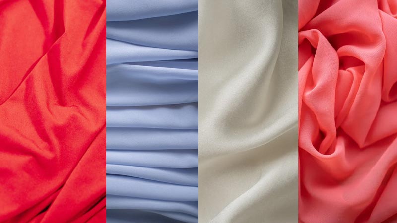
People are naturally drawn to various colors for various reasons, including personal preferences, cultural associations, and emotional responses. Here are some colors that are often found attractive:
Red
Red is a powerful, attention-grabbing color frequently associated with passion, love, and energy. It evokes strong emotions and is often seen as attractive due to its bold and vibrant nature.
In fashion, it can convey confidence and sensuality, while in interior design, it can create a warm and inviting atmosphere.
Blue
Blue is a universally beloved color, symbolizing calm, tranquillity, and reliability. Its soothing qualities make it attractive to many people. Lighter shades of blue can create a serene and peaceful environment, while deeper blues add a touch of elegance and sophistication.
Purple
Purple is often associated with luxury, creativity, and spirituality. It combines the stability of blue with the energy of red, making it an attractive and versatile colour.
Light purples like lavender convey a sense of romance and softness, while deeper purples exude opulence and mystique.
Green
Green is commonly associated with nature, growth, and renewal, making it an attractive colour for those who appreciate the outdoors and environmental values.
Various shades of green, from soft pastels to deep forest greens, can create a sense of harmony and balance in design and fashion.
Yellow
Yellow is a cheerful and optimistic colour that often attracts attention and exudes positivity. It’s associated with happiness and can be used to create a welcoming and sunny ambiance.
Yellow’s warm and inviting qualities make it appealing in both fashion and design.
Pink
Pink is often associated with femininity, love, and tenderness. Its gentle and romantic qualities make it attractive for those who appreciate softer, more delicate aesthetics.
Light pinks convey sweetness and charm, while deeper shades of pink add sophistication and elegance.
Turquoise
Turquoise is a captivating and refreshing colour that often reminds people of clear ocean waters. It’s associated with serenity and balance, making it an attractive choice for those seeking a calming and rejuvenating atmosphere.
Turquoise can be used to create a tranquil and stylish look in various design applications.
It’s important to note that individual preferences and cultural influences significantly influence what colours people find attractive. While these colours are generally considered attractive, personal tastes and emotional connections to specific colours can vary widely.
FAQs
What colour truly goes with everything?
While there isn’t a single colour that universally goes with everything, there are versatile options. Neutrals such as white, black, and grey come close. These colours serve as excellent foundations and harmonize with various other hues, making them ideal choices in various design and fashion contexts.
Can I combine bold and neutral colours successfully?
Yes, combining bold and neutral colours can create striking and balanced colour palettes. Neutrals like white, black, or grey can complement and enhance the vibrancy of bold colours, adding contrast and sophistication to your design or outfit.
How do I choose the best colour to match my personal style?
Selecting the right colour to match your personal style involves considering your preferences, skin tone, and the emotions you wish to convey. Start by experimenting with colours that resonate with you and complement your complexion.
Are there colours that are universally appealing in design?
While personal preferences vary, certain colours like blue and green tend to appeal broadly due to their calming and harmonious qualities. However, remember that cultural and individual differences significantly influence what’s universally attractive.
Can I create a versatile colour scheme for my home or wardrobe without using neutrals?
Yes, it’s possible to create a versatile colour scheme without relying solely on neutrals. You can select a primary colour you love and build a palette around it, incorporating complementary, analogous, or monochromatic colours.
Conclusion
In the world of colour, the concept of finding the hue that goes with everything remains an ongoing exploration of creativity and expression.
While there is no one-size-fits-all answer to the question of what colour goes with everything, the versatile colours discussed here serve as invaluable tools for designers, stylists, and anyone with an appreciation for aesthetics.
Whether it’s the timeless elegance of white and black, the adaptability of grey, the depth of navy blue, the warmth of beige, the richness of burgundy, or the earthy charm of olive green, these hues empower us to create harmonious and visually pleasing combinations.
In this quest for the perfect palette, we find that the beauty of colour lies not only in its individual charm but also in its ability to create a symphony of visual delight.
Leave a Reply